How to Design a Web App That Stands Out
Designing a standout web app is about tackling real issues your users face daily. The goal of web app design is not just to bridge the gap between technology and users, but to do so in a functional and enjoyable way.
This no-nonsense guide lays out the essential steps for designing a web app that stands out, supported by examples of web apps that nailed it. Follow along as we break down the process into actionable steps you can implement today.
What is web application design?
Web app design is the process of creating intuitive, efficient, and engaging web apps where users can achieve their goals with minimal fuss.
The role of web app design is twofold: first, to solve user problems through intuitive design and second, to make the interaction as efficient and pleasant as possible. This means prioritising functionality, usability, accessibility and aesthetics.
Designers must strike the right balance between what users want, what technology allows, and what the business needs to achieve.
Web app design combines user experience (UX) design and user interface (UI) design to ensure products are not only attractive but also intuitive and easy to navigate.
UI design
UI design deals with the tangible elements users interact with - think layout, buttons, typography, icons, and colours. But it’s not just about designing a visually appealing interface. UI designers solve problems related to visual communication and interaction design. A well-designed UI can enhance usability, making the product’s functions clear and accessible.
UX design
UX design is all about the overall feel of the web app, focusing on the end-to-end journey of the user and making it coherent and intuitive. It ensures users can find what they need without confusion or frustration. UX designers tackle issues such as usability, accessibility, and the overall flow of the app.
Web app design vs website design
Web apps and websites share differences so naturally, the process of designing a web app vs a website will be different too.
Nowadays, websites are more advanced than they used to be. Still, their role is primarily informational. They might include interactive elements, but these serve to enhance user navigation rather than being the core functionality. The design of a website is focused on layout, aesthetics, and straightforward navigation.
By contrast, web apps are interactive, dynamic, and built for user engagement. They require a more complex approach to design and problem-solving. As they often encompass complex interactions such as managing finances or editing documents online, the focus of the design team is on functionality, responsiveness and personalisation.
Why is web app design important?
Consider this: 94% of first impressions are design-related. When a customer first visits your web app, they are immediately drawn to how it looks and how easy it is to use. If you fail to grab their attention or solve their problem, they will leave and search for a competitor who can.
First impressions can have a lasting impact on the user’s perception of your company - its credibility, professional image, and trustworthiness. In fact, 75% of users judge a company's credibility based on its UX/UI design.
If this is not convincing enough, here are a few more reasons why you need to invest in web app design:
- Boost user engagement: A well-designed web app invites users in and keeps them engaged. By prioritising an intuitive user experience, you reduce frustration and increase the time spent on your web app.
- Strengthen brand identity: Consistent, thoughtful design reinforces your brand identity, helping your web app stand out in a crowded market. It’s an opportunity to make a memorable impression that aligns with your mission and values.
- Build trust: As we already mentioned, professional-looking and functional design can promote confidence in your users, especially if they don’t know anything about your product.
- Drive conversions: At the end of the day, web app design can directly influence your bottom line. A research by Forrester found that a well-crafted UI can boost conversion rates by 200%, while effective UX design can increase conversions by up to 400%.
How do you design a web application?
The web app design process is a structured approach that takes your project from concept to completion, ensuring every aspect is optimised for success. Let’s break it down into its key steps:
Step 1: Research and Analysis
Before even going into the design process, you need to have an excellent understanding of your users’ needs, market trends, and competitor strategies. Spend your time gathering insights that will inform your design decisions.
Step 2: Design Strategy
Based on the insights gathered, the next step is to define the web app’s core features. This involves setting clear objectives for what the web app will achieve and how it will benefit the user.
Step 3: Wireframing
Start with creating wireframes to outline your web app’s structure. This step is crucial for visualising the basic layout, functionality and user flow, allowing for quick iterations and problem-solving early in the process.
Step 4: Prototyping
A company may opt to create a click-thru prototype to test with real users and refine the final product, or to aid their funding rounds by letting investors try out the product.
Step 5: Refining the UI
With your product’s ‘skeleton’ in place, the focus shifts to refining the visual design and UI of the web app. This involves adding cosmetic touches such as colours, typography, optimising the layout and other branding elements.
Step 6: Testing and Iteration
Testing is a step that you don’t want to skip or neglect. You may have a few UI and design options to test with real users and see which one performs better. Usability testing is also crucial to spot issues before development.
Step 7: Implementation
The design is handed over to the development team who will bring it to life. Your dev team needs to work closely with the design team during this step to ensure the design vision is properly translated into the final product.
Step 8: Design Review Process
The design process doesn’t end at launch. You need to set up a design review process where you regularly evaluate, update and refine your product’s UX and UI to reflect user expectations and technology over time.
Modern & effective web app design examples
Airbnb
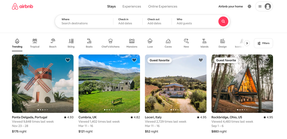
Airbnb excels at creating a user-centric booking experience. The UX design simplifies the journey from searching to booking accommodations, while the UI delights users with high-quality images and a clean, inviting layout.
How they do it:
- Detailed yet intuitive search filters: Airbnb allows users to filter their searches with criteria that range from the number of rooms to pet-friendly listings. This feature ensures users can quickly find what they are looking for.
- Visual storytelling: Through high-quality images and a clean layout, each listing tells a story, making users feel like they're already on their vacation. This emotional engagement is key to Airbnb's design success.
- Personalised recommendations: Airbnb’s user experience is also highly personalised as they suggest recommendations based on users’ behaviour, previous searches, and preferences.
Key Takeaway: Personalisation plays a significant role in enhancing the user experience. Airbnb shows how delivering a seamless and personalised user experience can create a strong connection between the user and the platform.
Trello
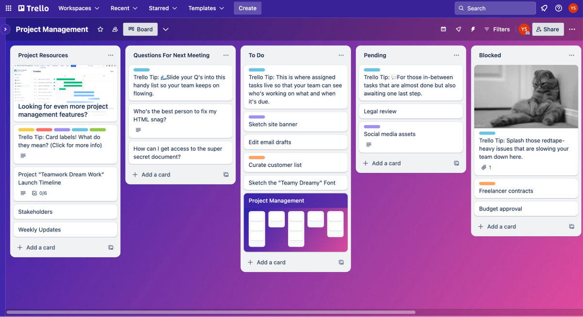
Trello uses a Kanban board layout that provides a straightforward and flexible way to manage projects. The drag-and-drop functionality is a great example of intuitive web app design. Users can easily add, organise, and move tasks between different lists and stages of completion. Trello also utilises colour-coded labels to enhance the visual appeal and functionality of the product.
Key Takeaway: Prioritise visual simplicity for complex tasks. Trello shows that a visual and interactive approach to task management can make even the most daunting projects feel approachable and fun.
Notion
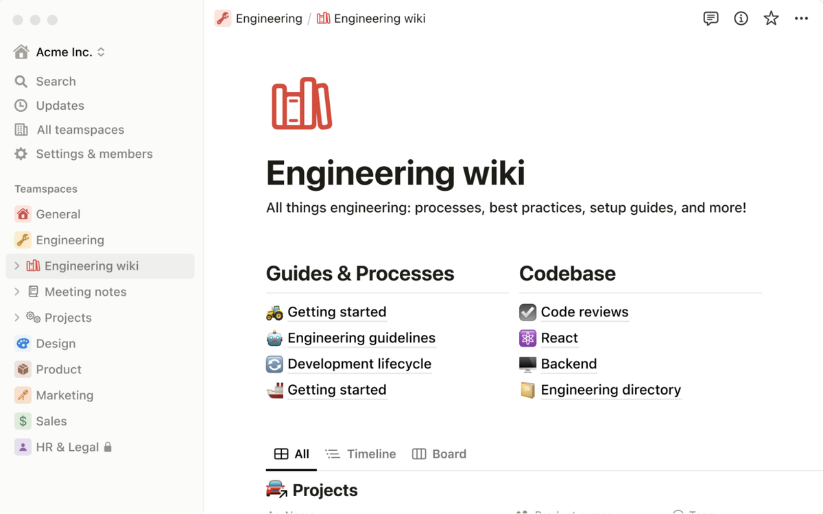
Notion is a productivity tool that combines your docs, projects, notes, and tasks all in one place. The design stands out with flexibility and user empowerment, allowing users to create their own personal or collaborative workspaces with a drag-and-drop feature similar to Trello. The interface is clean and minimalistic, reducing cognitive load and focusing on user content.
Key Takeaway: A neat yet highly customisable design that puts user content at the forefront helps in creating a versatile tool that’s appealing to a wide range of users with different goals and workflows.
Figma
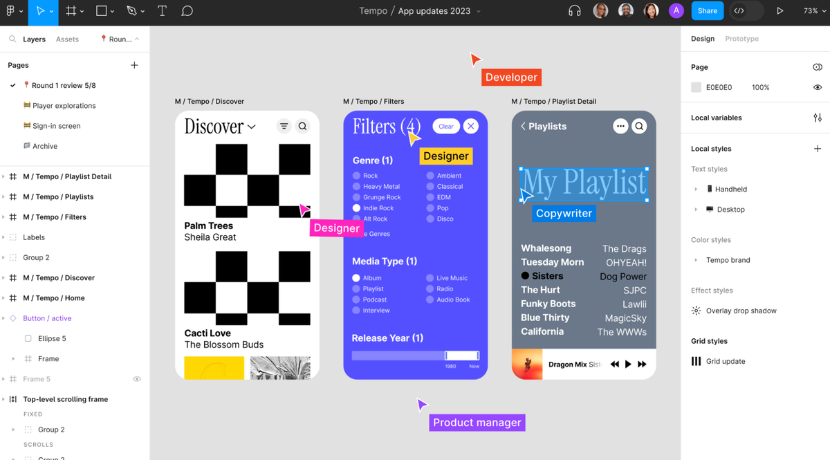
Figma streamlines the UX/UI design process with its collaborative, browser-based interface. It allows teams to design, prototype, and gather feedback in real time, all within a single platform. The UI is remarkably intuitive, making it easy for newcomers to start using the tool right away while offering advanced features for more experienced designers.
Key Takeaway: Ensure your web app's interface is intuitive, reducing barriers to entry for new users while providing depth and flexibility for experts.
Canva
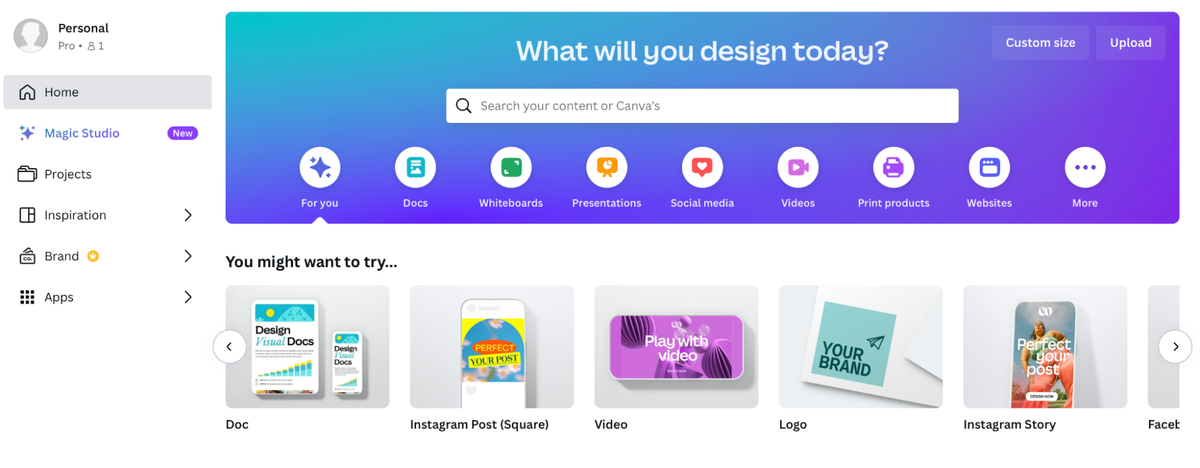
Canva is an online graphic design tool with a user-friendly interface, making design accessible to everyone, regardless of their skill level. The web app shines with a vast library of templates that users can easily customise, images, and design elements, organised intuitively for easy navigation. Canva’s design encourages creativity and experimentation, supported by a straightforward flow that guides users through the design process without overwhelming them.
Key Takeaway: Empower your users by providing the tools they need in an accessible way.
Legaleyse
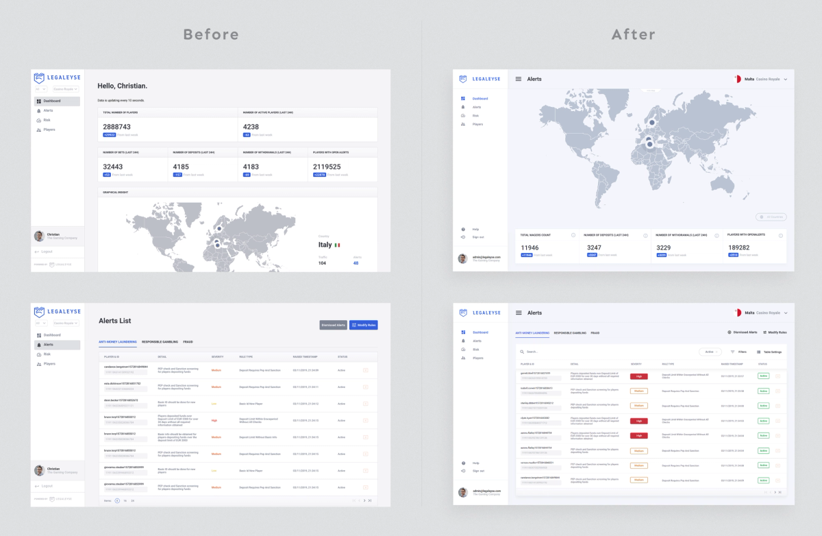
Legaleyse tackles the complex challenge of regulatory compliance in the iGaming sector with a robust real-time monitoring platform. Addressing initial drawbacks like slow performance and UX/UI inconsistencies, the platform underwent a design overhaul to optimise load times and create a mobile-friendly experience.
Implementing minimal yet impactful changes - improved structure, layout, and alignment, better contrast and the use of colour for a clear visual hierarchy - drastically improved the platform’s overall user experience.
Key Takeaway: Prioritise performance and cross-platform compatibility to meet modern user expectations. Legaleyse demonstrates the critical impact of optimising load times and ensuring visual and functional consistency across screens.
You can read more about how we achieved this in our case study.
Wrapping up
Whether it's through simplifying complex processes, leveraging personalisation, or promoting collaboration and community building, building successful web apps comes down to one thing: a commitment to solving real problems for real people.
By applying these insights to your projects, you can take your web app design from good to great, ensuring that your product stands out.


