The best live chat tools for startups
Technical analysis of the competition and criteria that matter
What live chat tool are you going to use for your startup?
Live chat tools for startups - What are the assessment criteria?
We will be assessing the following criteria on each chat client:
- Easily accessible — We’ve all had to go through that hidden, long signup form at some point. An inaccessible chat means that clients will already be frustrated before getting in touch with you. To meet this requirement, the tool needs to be accessible from any page and within a few clicks . It also means that the user only needs to enter minimal details before getting in touch. Additional details can be acquired during chat or after the chat.
- No downtime/Downtime guarantees/Downtime history — as they say, “time is money”, and downtime on your chat tool can potentially mean frustrated customers — or worse, lost customers.
- Multiplatform support — Keeping in touch with your user base is important. When your sales team transfers a customer to you, the platform should allow you to use any of your devices to respond (whether that is IOS, Android or your desktop environment)
- Multi-user support — the tool should be able to accommodate your team, not vice-versa. The tool should allow any person on your sales team to respond, and detect when one of the members is offline to redirect traffic. The average size of a startup is 3–5 members, so we will compare costs for 3 and 5 users respectively
- Cost — the tool should be as inexpensive to use as possible.
- Website impact — The tool should have minimal impact on site performance. The website size inspector add-on was used to test this
- Reduced time to interactive — The sales staff should receive a notification when a user starts entering their question
- Easy file upload — both users and clients should be able to upload files to the opposing party
- Customizable — This includes theming, custom text, positioning, and compatibility with multiple frameworks. The tools should fit your website theme, not vice versa. Themeing should include custom colors, as well as hooks on when to show the client
- Time to integration — Does the company need to be contacted manually for integration/Demo before starting? How easy is it to create a proof of concept? Are there paywalls to making your proof of concept?
Who are the contenders?
Many companies are offering live chat clients. These were chosen from review sites and were manually filtered by chat functionality and cost (one of which was https://www.softwareadvice.com/ ). Other review sites were also used to get the best contenders.
Hubspot — 8/10 criteria met
Verdict: A solid platform, but it has its downsides. The dashboard looks polished and professional.
- Easily accessible — chat window can be available on all pages. There’s a bot that can ask for the details automatically.
- No downtime — Downtime history is available , and seems to happen several times a month. While we appreciate the honesty, we still have to deduct points for this
- Multiplatform support — Yes, it has mobile apps, as well as a web app
- Multi-user support — Yes, but automatic conversation routing based on keywords is locked behind a paywall. See here
- Cost — Hubspot (free) is available for chat only, but routing is a paid feature. Hubspot (paid) costs $1200 for 5 users (90% off for the first year for startups). So the first year will cost 120$. This increases every year (90% the first year, 50% off the second year, and 10% off the third year)
- Website impact — Hubspot added 67kb to the website payload (which is respectable)
- Reduced time to interactive — By default, a notification happens when the conversation is handed off to you. There is no notification while a new user is typing their message (no time to prepare).
- Easy file upload — Yes
- Customizable — Theming allows custom colors and custom text in chat.
- Time to integration — No manual demo is required, and the setup process is clear. No paywalls in setup
Zendesk- 7/10 criteria met
Verdict: Special features like “trigger chat window after X seconds” could add to your sales numbers, however, the UI feels more dated than the competition. Zendesk also adds user analytics.
- Easily accessible — the chat window can be available on all pages, and a pre-chat form can be enabled to ask for details.
- No downtime — Monthly degraded performance/downtime is not an irregular occurrence, as can be seen here
- Multiplatform support — Yes, it has mobile apps, as well as a web app
- Multi-user support — Yes, but this is behind the “enterprise” level paywall, which would cost €3540/year for 5 members
- Cost — the cheapest plan with 5 members costs €840, however startups can apply to get half a year for free (which results in €420 the first year).
- Website impact — Zendesk added 500kb to the website payload (which is larger than the competition)
- Reduced time to interactive — By default, a notification happens when the conversation is handed off to you. There is no notification while a new user is typing their message (no time to prepare). What’s more, when no one is online, by default the chat does nothing to indicate that no one is available to take the message
- Easy file upload — Yes
- Customizable — Theming allows custom colors and custom text in chat.
- Time to integration — No manual demo is required, and the setup process is there, but not as user friendly as some of the competition. No paywalls are in the initial setup, and no card is required for the first 2 weeks of use
Freshdesk-5/10 criteria met
Verdict: Usable, but not recommended. The Freshworks product line is spread over multiple domains, the initial setup is confusing, and the default settings need to be changed heavily to enable chat use. The web client has no-built in audible/visible notification when a new message is received.
- Easily accessible — chat window can be available on all pages. Enabling a pre-chat form is in their FAQ, but the video link seems broken .
- No downtime — Monthly degraded performance/downtime is not an infrequent occurrence as can be seen here
- Multiplatform support — Yes, it has mobile apps, as well as a web app
- Multi-user support — Yes
- Cost — while there is a free tier, this does not allow messages. Freshdesk for 5 people costs 900$/year. Startups could get 3 free users, which lowers this cost to 360$/year.
- Website impact — Freshdesk added 24kb to the website payload (which is lower than the competition) however, opening the chat felt sluggish because of their animation
- Reduced time to interactive — By default, a notification happens when the conversation is handed off to you. There is no notification while a new user is typing their message (no time to prepare).
- Easy file upload — Yes
- Customizable — Theming allows custom colors and custom text in chat.
- Time to integration — No manual demo is required, and the setup process is there but was confusing when compared to the competition. The Freshdesk chat client is known as Freshchat and is on a whole different domain. Other UX issues are prevalent in the UI (such as not allowing the user to deselect platforms needed during initial setup) which makes the experience feel unpolished. No paywalls are in the initial setup, and no card is required for the first 2 weeks of use.
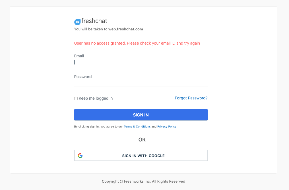
This is an example of the aforementioned bad UX. I went through the setup on the site, however, I can no longer sign in with google. I am still able to change settings on another tab.
HelpScout — 6/10
Verdict: HelpScount is a solid platform with an easy UI to use and setup. It has more customization options than the competition. The only downside to the web app is that it is silent — it only shows notifications visually/through the browser’s notifications (no audible sound on chat).
- Easily accessible — chat window can be available on all pages, however, no help related resources were found on pre-chat forms
- No downtime — Helpscout suffers downtime/degraded performance approximately once a month as can be seen here
- Multiplatform support — Yes
- Multi-user support — Yes
- Cost — The standard Plan for 5 users costs 1200$/year, with the first 3 months free (900$ the first year)
- Website impact — Helpscount added 270kb to the website payload (which is about average) .
- Reduced time to interactive — By default, a notification happens when the conversation is handed off to you. There is no notification while a new user is typing their message (no time to prepare).
- Easy file upload — Yes (only images)
- Customizable — Theming allows custom colors and custom text in chat. The options felt more customizable than the competition
- Time to integration — No manual demo is required, and the setup process very user friendly. No paywalls are in the initial setup, and no card is required for the first 3 months of use. Whenever something unexpected happened, the UX was somehow able to guide me to where I should be checking.
Tidio — 8/10
Verdict: Tidio has one of the best UIs available, and we had it working within the first 2 minutes of setup. However, the widget is less customizable when compared to the competition
- Easily accessible — the chat window can be available on all pages. Tidio has a pre-chat survey which can be used to acquire the email.
- No downtime — Tidio suffers downtime/degraded performance approximately twice a month as can be seen here
- Multiplatform support — Yes
- Multi-user support — Yes
- Cost —Free for up to 3 users, and you can add 2 more users beyond that (unspecified pricing, couldn’t fund it)
- Website impact — Helpscount added 280kb to the website payload (which is about average ).
- Reduced time to interactive — By default, a notification happens when the conversation is handed off to you. There is no notification while a new user is typing their message (no time to prepare). What’s more, when no one is online, by default the chat does nothing to indicate that no one is available to take the message
- Easy file upload — Yes (only images)
- Customizable — Theming allows custom colours and custom text in chat.
- Time to integration — No manual demo is required, and the setup process very user friendly. No paywalls are in the initial setup, and no card is required for the first 3 months of use. Whenever something unexpected happened, the UX was somehow able to guide me to where I should be checking.
Collect Chat-3/10
Verdict: The collect chat has a modern UI, however, it is also quite buggy. Removal of the default bot seems to have broken the site completely. Until this issue is resolved, the Collect Chat is hard to recommend.
- Easily accessible — the chat window can be available on all pages and there are hooks to enable/disable the chat based on the page URL. The user can also use the scripts section to automate the capture of email addresses.
- No downtime — Collect chat has no information on current/past downtimes and has no support page for when it happens. Based on the competition’s downtime, it is unlikely that this never occurs, so points were deducted for this.
- Multiplatform support — No
- Multi-user support — Couldn’t check, see below
- Cost — Couldn’t check, see below
- Website impact — CollectChat added to the website payload (which is about average ).
- Reduced time to interactive — By default, a notification happens when the conversation is handed off to you. There is no notification while a new user is typing their message (no time to prepare). What’s more, when no one is online, by default the chat does nothing to indicate that no one is available to take the message
- Easy file upload — Couldn’t check, see below
- Customizable — Theming allows custom colors and custom text in chat.
- Time to integration - Couldn’t check, see below
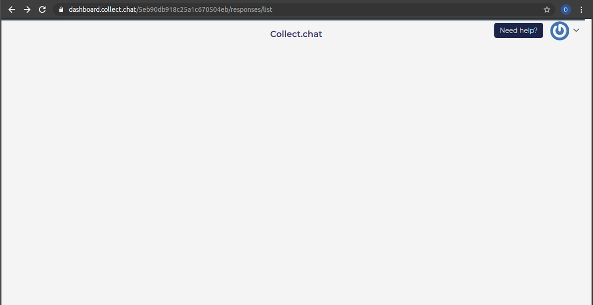
While browsing around in the settings for bots, the page broke completely and I couldn’t leave this page at all. The sidebar disappeared and I was left without any way to proceed with the evaluation. The issue seemed to persist after I reopened the dashboard.
Chatra-9/10
Verdict: The chatra chat has a modern interface, and feels quite polished overall. It offers average levels of theming customisation and has above average features. The UI is intuitive to use. On the customer side, the bot seems to make no sound when a new notification is sent (however it makes a sound whenever the clients contact the site).
- Easily accessible — chat window can be available on all pages
- No downtime — Chatra has no information on current/past downtimes and has no support page for when it happens. Based on the competition’s downtime, it is unlikely that this never occurs, so points were deducted for this.
- Multiplatform support — Yes
- Multi-user support — Yes
- Cost — Chatra costs 900eur/year for 5 agents, and is free for 1 agent
- Website impact — Helpscount added 10kb to the website payload (which is the smallest by far).
- Reduced time to interactive — By default, a notification happens when the conversation is handed off to you. There is no notification while a new user is typing their message (no time to prepare). When no one is online, they have a customisable message available which is quick to find from the UI. They also have typing insight which “allows agents to see what visitors type before they hit send”. Because of this last feature, no points were deducted
- Easy file upload — Yes
- Customisable — Theming allows custom colours and custom text in chat.
- Time to integration — No manual demo is required, and the setup process very user friendly. No paywalls are in the initial setup, and no card was required in the first 10 day trial.
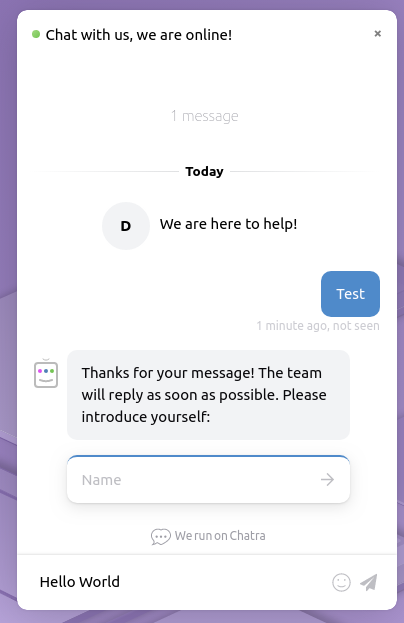
[1] Reduced time to interactive, customer-side
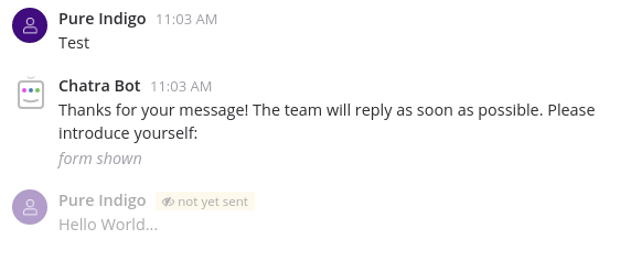
[2] Reduced time to interactive, business-side
The settings on Chatra are also easy to find — from bot customisation, to chat integrations, we felt that it was easier to find what we need without thinking too hard.
Conclusion
We have found that the Chatra solution fits our case the best. It should be noted however that other chat clients should still be considered when making a final decision, especially if what you had in mind was heavy customisations.


